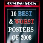
Movie posters have the power to make or break a films success at the box office, so it’s important to get it right.
However, designing a poster that is striking, attractive, intriguing and memorable is no easy task. As a graphic designer on the side, I know this first hand. Therefore, I feel it’s important to commend the posters of 2008 that were able to achieve such a standard of quality. I also feel like letting off some steam and listing the posters that completely missed the mark.
To see a poster full-size, click the image.

|
10. The Women
This poster is a classic example of how a body of text can effectively be used to create imagery. Despite the film being the very definition of a chick flick, the eye catching splash of red cunningly defines a shape nearly every adult on the planet desires to either have or to gaze upon. It’s simple, yet remarkably striking.
 |
9. Funny Games
Design by Crew Creative Advertising
It’s one of those posters that is inexplicably mesmerising. The beautifully photographed Naomi Watt’s, with high contrasts distinctly framing her distraught face, clearly suggests that this isn’t a laughing matter. Nothing here is coincidental; the distinct black space above her hairline is almost pushing her downwards, deeper into misery. The simplicity of the text allows the emotive image to do all the talking, whilst still reminding us that this a film and not merely piece of stunning photography and rendering.

|
8. Burn After Reading
Design by Mojo LLC
This audacious poster sells the film entirely by naming its cast rather than picturing it. Too many films in 2008 were marketed exclusively by showing a close up of their stars, such as Seven Pounds and The Curious Case of Benjamin Button. Burn After Reading almost mocks these films by saying; “we’ve got so many freakin’ stars we can’t fit them onto one poster, so we’ll just name them all instead.” Throw in some quirky typography, a bold colour scheme and an intriguing little silhouette and you’ve got yourself a winner.

|
7. Quantum of Solace
Design by Empire Design
Let’s be honest, a Bond film hardly needs any sort of marketing to garner hype. Yet this poster manages to do what I didn’t think was possible; make James Bond look cooler than he already was. Refreshingly, it doesn’t even feature the mug of infamous hero like nearly every poster before it. Instead, the minimalist image of Bond’s shadow screams ‘anger’ and ‘revenge, representative of Bond’s motives in the film. Also, the faded hues and cracked dirt background is connotative of the gritty and serious new direction of the franchise. Not to mention that it smugly features a logo that alone could sell a used tissue.

|
6. The Spirit
Design by Ignition Print
They say don’t judge a book – or movie for that matter – by its cover. If you did, you might have been lead to believe The Spirit would be a good film. This poster demands attention with its striking typography, clearly inspired by the works of Escher. The sepia tones, brooding shadows and ominous skyline instantly implies that this is classic film noir. Once again, a touch of red is effectively used to draw the eye to the title after the impact of the tag line subdues. The end result is a beautiful yet menacing image that is irresistible to the eye.

|
5. The Air I Breathe
Design by Art Machine
I’m a sucker for glaring juxtapositions. Aside from being a tremendously beautiful and bold image, the radiant beauty of a butterfly sitting at the tip of a dark, silhouetted killing machine oozes significance. The colour scheme, if you might have notice on this site, is one I dearly approve of. In fact, this poster would have topped my list had it thrown away with the faces, which work only to detract from the images impact.

|
4. The Dark Knight
Design by BLT & Associates
Whilst this poster is certainly my favourite, nearly all of the posters for The Dark Knight deserves a place on this list. However, it is this menacing poster that first revealed what is quite easily the most infamous slogan of 2008. Why So Serious? Well, the blood smeared lettering and psychopathic grin isn’t exactly what you’d call jovial. It certainly gets across the “Dark” part of “The Dark Knight”. It is also happens to be an image I expect will live with me forever, which is more than what any poster designer could ever possibly hope to achieve.

|
3. Man on Wire
Design by All City
Not many films can get away with taking a still from the film and simply slapping it on the poster. Man on Wire can, as it happens to be an image of the likes that will never be seen again. You just can’t help that uneasy feeling you get when you see a glimpse of the Twin Towers. Yet the most remarkable aspect of this poster is that it hardly even features the most iconic buildings of the last century. This is because, like the film it advertises, the poster is a celebration of beautiful achievement of Frenchman Philippe Petit and not a tragic tale of loss and destruction that has since plagued such imagery.
To put bluntly; this poster grabs your attention like I imagine it would if you realised your crotch was on fire.
|
|

2. Cloverfield
Design by Art Machine
It’s been done countless times before, but this teaser poster for Cloverfield took the whole “image of an iconic structure in ruins” thing to a new level. Why? Because it was a completely out of the blue image of an iconic structure in ruins. With just a date to go with and nothing more, the film garnered an unprecedented amount of buzz as no one even knew the actual name of the film. The internet community went rabid with speculation, not only about the name, but about what they believed was responsible for the destruction of the Statue of Liberty. Some even looked at the poster for so long, they became convinced that there was an outline of a monster hidden in the clouds. Don’t believe me? Well, see for yourself, it’s on youtube. If that’s not the result of ingenious marketing, then I don’t know what is.

|
1. Blindness
Design by Concept Arts
Fact: typography alone can make a brilliant poster. The title alone is so cleverly figurative and visually arresting; it doesn’t even need the added intrigue of the background image. The fact that it’s so damn simple makes it so damn good. Like any good teaser poster should, it hits you all the information needed to make you want to see the film within the blink of an eye. The witticisms don’t end there; I think the only way you’d be able to look past this poster is if you are, wait for it…. blind.
Honourable mentions:
More great posters of 2008 that didn’t quite make the list. Click poster for a full sized version.

|

|

|

|
|
Choke |
Max Payne |
Forgetting Sarah Marshall |
Punisher: War Zone |

|

|

|

|
|
The Eye |
Taxi To The Dark Side |
The Guitar |
The X Files: I want to believe |
Now it’s time to get nasty. Below is what I consider to be the worst posters of 2008. It could be because they are poorly composed, terribly unoriginal or because they did everything but make me want to see the film they are advertising. However, more often than not it’s because they feature an actor I severely detest. Let the bashing begin.
|
|

10. Pride and Glory
If you’re going to use bold and striking typography for the name of a film, make sure the title of the film is actually worth emphasising. I mean, Pride and Glory? Sounds like an army recruitment drive…
|
|

9. Step Up 2
Having not seen the film, I’m still trying to work out if that’s sweat or rain. The orange glow suggests it’s too sunny to be raining, so I’m going to go with sweat. In that case, obscenely sweaty dancers in a crassly overloaded poster just don’t do it for me.
|
|

8. Drillbit Taylor
I swear if I see Owen Wilson pull that pouty-lipped face once more I’ll personally finish what he started.
|
|

7. Chapter 27
I didn’t realise they we’re making a sequel to Super Size Me.
|
|

6. Untraceable
Or more commonly known as Flightplan 2.
I’m sorry, but Dianne Lane’s listless mug alone isn’t famous enough to sell a mediocre thriller. Also, is that mouse pointer about to pick her nose?
|
|

5. Changeling
I never realised how freaking huge Angelina Jolie’s head is. I never want to realise that again, either.
|
|

4. Mirrors
Insert scared looking face. No, scratch that; insert completely generic and totally random scared looking face. Yawn…
|
|

3. Fools Gold
If you’re like me, then you have an uncontrollable urge to hit Matthew McConaughey in the face whenever you see him. Oh and they are tinted gold. Get it?
|
|

2. Postal
Ok I was wrong; I’m not always a sucker for glaring juxtapositions.
It’s just so terribly composed; Photoshop has feelings too, you know.
Also, if you’re trying to sell a movie, featuring the words “A film by Uwe Boll” is unquestionably the worst way possible to go about doing it.
|
|

1. Bangkok Dangerous
Why is this the worst poster of 2008? It might be because I dry heave a little whenever I see Nicholas Cage in a wig, or it might be because the title is possibly the most laughable of the year. However, I do take satisfaction from the way it looks like Nic Cage is punching himself in the shoulder. Hell, it saves me the effort.
So there you have it! Think I missed a gem or forgot to mention a steamer? Let me know by leaving a comment below!
![]() Follow the author Anders Wotzke on Twitter.
Follow the author Anders Wotzke on Twitter.


")