Of all the filmic things I write about on this little corner of the internet, I look forward to sharing my thoughts on year’s best movie posters the most. I just adore good graphic design, almost as much as I adore good movies. Heck, I’m the guy who’ll flick through a magazine just to look at the composition of the ads, shaking my head in awe at the inventive ways in which they manage to market something as mundane as a bottle of water.
Movies, however, are not mundane at all. Why, they can be awesome! But before we go and watch them, we like to know what they’re about. We like to know what genre they pertain to, and the actors they feature. We like to know what the critics have said about it, and what the censorship board have rated it. In short, we like to know what to expect, and that’s where a film’s key art — the main image associated with a given movie — comes into play. Whether you see it lining the walls of your local cinema, plastered on a billboard on your way to work or buried in a blog post much like this one, a movie’s key art is often the first contact you’ll have with an upcoming release. And you know what they say about first impressions…
Below are some of the best examples of key art from 2011. They’re attention-grabbing, beautifully composed, richly symbolic and indicative of the mood of the movie. They say a good poster can sell you a movie in three seconds. Well, these are the ones that do it in two.
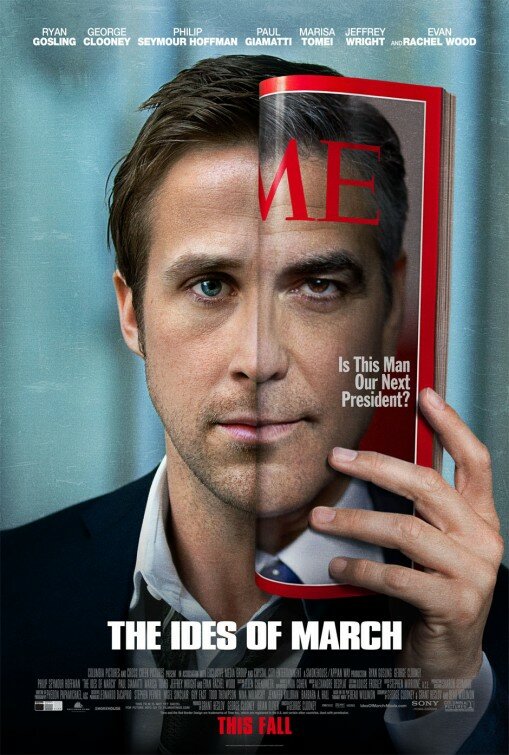
Drenched in symbolism, this masterful design tells you everything you need to know about the film, and then some. With his tie loose and top button undone, we quickly establish that Stephen Meyers (Ryan Gosling) is the political young gun of the story, working for Governor Mike Morris (George Clooney), a presidential candidate. It’s telling that Morris' TIME magazine cover folds back to reveal Gosling’s face, as Meyers is the man behind Morris, writing his speeches and advising his actions. The fact that there is near-perfect symmetry between their faces is no coincidence, either, as Meyers is a Morris in the making. But take one look at Clooney’s furrowed brow and tell me he’s not hiding something. That's the underlying message of the movie: the political realm is full of egos willing to say and do anything to get ahead. “It’s not about you,” Clooney’s subtle scowl might as well be saying to the voting public. “It’s all about TIME.”
Clever, no?
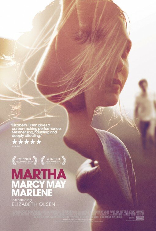
Often when a poster features superimposed images, it looks jarring and amateurish, but this one is nigh on perfect. (Well, except for the choice of font, but let's not dwell on that). With a kind of sensual unease, this sun-bleached bastion of good design tells the story of a lost soul looking for her place, and how a sinister father figure – seen ominously approaching in the background – sniffs out and takes advantage of her whimpering soul. It’s almost as if we’ve caught Elizabeth Olsen mid hair flick as she basks in the warming glow of the sun, eyes closed, wishing she could find the same warmth elsewhere. Ok, so I’m probably overthinking it, but how can you not. This poster just absorbs you.
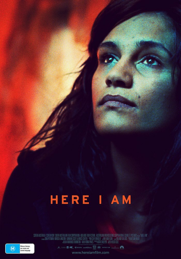
There are colours… and then there are COLOURS. I’m pretty sure there are hues of blue and red on this poster that I have never even seen before, and now that I have, I feel like I’ve been missing out. It’s kind of fitting, too, that the film follows indigenous Australians, which some may (archaically) refer to as “people of colour”. Like a phoenix rising from the ashes – is that a bushfire raging in the background? – the woman pictured is looking to start afresh, and her empowering stance encapsulates the film’s title far better than an arrangement of words ever could. “Life affirming” is one way to describe the raw emotion of this poster, “awe-inspiring” is another.
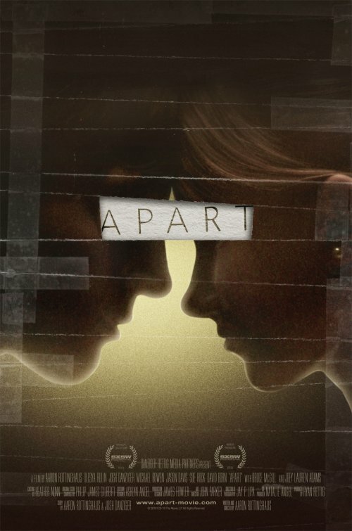
I’ve never heard of this film before, but while trawling through the internet looking for posters to compile this list, this one immediately stood out. As two softly-lit young lovers rest heads against a translucent yellow background, the word I keep arriving at is “embryonic”. The sellotaped borders are telling of a photo that has been ripped up and stuck back together again, the only piece missing being the gatekeepers of the soul, the eyes. I’m reluctant to point out that “Torn” is the unspoken verb of the title, because it’s so perfectly conveyed, I'm sure you knew that already. I may have never heard of Apart before, but I’m all ears now.
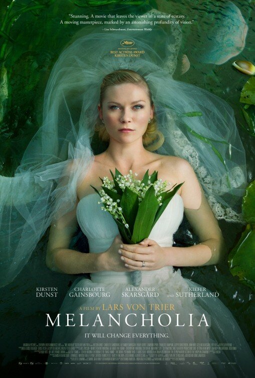
Have you ever seen someone this stunning look so morose, so deceased, on their wedding day? You’d think it was the end of the world or something! Oh wait...
This poster for Lars Von Trier’s art-house apocalypse has earned its place on this list for one simple reason: that photograph is magnificent. All the Photoshop pros in the world could not recreate an image as gorgeously composed as this one. That’s not to say it hasn’t been touched up – see the looming planet's reflection? – but it’s done is such a natural way, it abides by what Photoshop was designed for in the first place: enhancing photos, not massacring them.
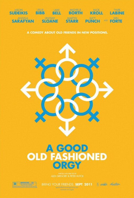
I chuckled when I first laid eyes on this witty design, did you? For starters, it’s rare for an ensemble film to have a poster where each actor’s mug is not lazily plonked inside a box like the Brady Bunch, but I guess when your biggest star is Jason Sudeikis, that wasn’t exactly an option. You might say that anyone who can open Microsoft Paint could have made this poster, but that’s like saying anyone with a few bits of wood could have invented the wheel. It’s less about the complexity or technicality of the execution than it is about the strength of the concept. And when you think about it, this concept is probably the most impenetrable thing about this movie. Zzing!
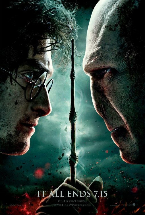
The face-to-face, good vs. evil poster is nothing particularly new, but when it’s done right, by gosh, is it done right. The intensity of the colours, the starkness of the lighting, the power of the symmetry and that nasty reptilian nose; this poster for the final Harry Potter just oozes epic. Much like the films, observing the evolution of the posters is a journey through adolescence itself.
Boy wizard? Not anymore.
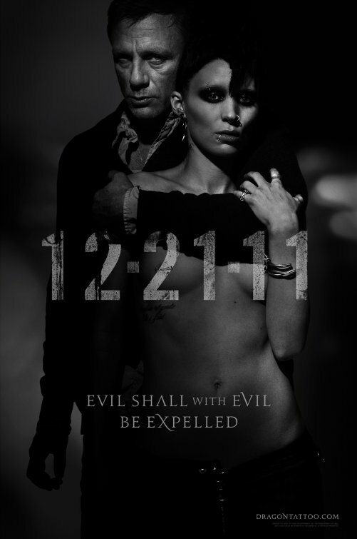
A poster that embraces sexuality this fearlessly is so rare in Hollywood, it’s worth celebrating when it comes along. In fact, had they chosen not to market David Fincher’s latest film with such gritty, gender-centric imagery, they would have done wrong by the Swedish source material, which was originally (and tellingly) titled ‘Men Who Hate Women’. Picturing a haggard Daniel Craig clutching a topless Rooney Mara around the neck, you might initially think the image reinforces the old “man dominating woman” stereotype. But take one look at Mara’s unruffled expression and firm returning grasp, and you’ll be forced to stop and think: who’s really wearing the pants in this relationship?
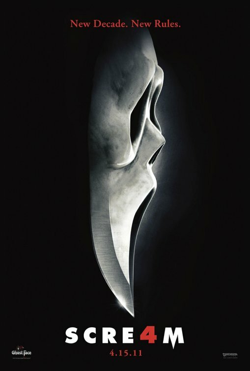
The one thing you should know about design is that less is almost always best. A poster that will grab your attention is usually the one with a simple yet striking bit of imagery, and this key art for Scre4m fits the bill perfectly. Ok, so it’s a little bit similar to the classic Halloween poster, but there’s no mistaking the Ghostface mask as anything but Wes Craven’s iconic series. Notice the way the tip of the knife leads the eye directly to the Scre4m title treatment; that’s called the visual hierarchy of the design, and an effective poster will make sure our attention winds up at the title sooner rather than later. Why? Because you don’t recite an image when you buy a ticket at the box office...
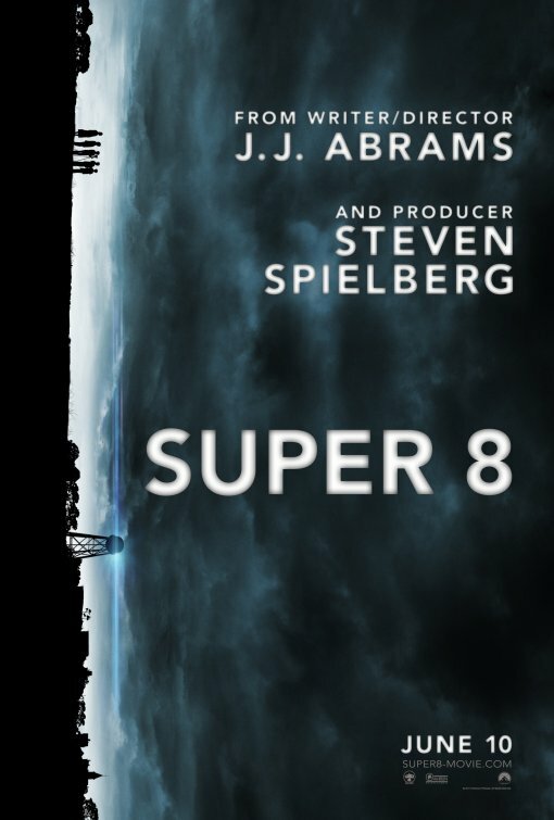
I’m sure everyone has tilted their head at least once to observe this brooding beauty, which by way of an insidious skyline, cleverly highlights just how puny we all are in comparison to whatever the hell is out there. It also mimics the orientation of a strip of film, which is no doubt being wound through the Super 8 camera in possesion of the silhouetted kids. Yes, the credits are a little garish, but when Spielberg is involved, you’d be mad not to slap his name on there in a big, bold font. To top it off, there’s also one of J.J. Abrams' signature lens flares highlighting a key location in the film. A nice bit of ‘wink-wink’ in an otherwise mysterious bit of marketing.
By a whisker, these are the posters that didn't quite make this year's Top 10, but are too good to not share with you anyway. Next year, in the unlikely chance that I'm less lazy than I am now, I might do a Top 20 instead.
Click on an individual poster to see it in all its glory.
When you're ready, click the 'next' arrow below to begin the countdown.
Stay tuned for my list of the 10 Worst Movie Posters of 2011.
Read my lists for 2008, 2009 & 2010.
 Follow the author Anders Wotzke on Twitter.
